Seedvault Backup: Why not add a launcher icon?

Hooray for Seedvault Backup! At last there is an open-source backup solution that can be built in to de-Googled Android-based phones such as those running LineageOS or CalxyOS. I should write more about why this is a fantastic development, but not right now.

This article is about something else: the importance of keeping a very clean default launcher experience for the Ordinary User, and how surprising the habits of the Ordinary User may seem to us if we are a developer or a Power User.

This story starts with Seedvault Backup currently (mid-2021) being relatively hard to find and awkward to access in the Android system settings menus. A developer proposed making it easier to find and access by adding a launcher icon for it. This would certainly make it easier to find and access. But here is the long version of my response to that proposal.

TL;DR: In my opinion it is probably best NOT to add a launcher icon by default, because that is not in the best interest of the ordinary user in their ordinary every-day activities. Basically, my argument is that an Ordinary User will treat it as set-and-forget settings, and will want to ignore it for nearly all of their life, so we shouldn’t insert an icon for it among their user apps.

The rest of this comment is rather long. It is not meant to be a rant, just a fuller explanation of why I make this suggestion, and I thought I might as well write it all down as it may not all be obvious to everyone.

I understand, it would indeed be nice to make the Seedvault UI a bit easier to find and access. It would especially be nice during the time I (the user) am setting up and testing the backup procedure, when I need to access it again and again. Let’s come back to this later, towards the end of this long comment. But I am not the ordinary user and this is not the usual way of using my phone, so let’s first think about the ordinary user in their ordinary usage.

I have had the privilege of watching a real Ordinary User recently and this is what I found in real life. The “ordinary user” I speak of is quite surprising to us techies: it is a person who is focused on their own activities and does not care to spend time understanding or interfering with how their phone is working. In fact we might consider them to be neglecting their phone’s needs and health. This ordinary user does not want to customize their phone: they do not even add favourite apps to their home screen! They just find them in the launcher or in recents. This ordinary user does not care about keeping the software up to date, they only do so if a pop-up forces them to, otherwise they ignore it. This ordinary user does not even bother to dismiss their notifications! That’s an optional extra thing they don’t need to do, they don’t want to waste their brain space on it, they just want to do something particular with some particular app right now and then shut the phone.

A typical default launcher such as on LineageOS shows all the user apps, plus just one “Settings” icon. That seems an intentional and user-focused way to organize things. The ordinary user likes to get some help setting up the phone, and then forget about it. They don’t need or want to visit what they regard as low-level settings like these again, so they don’t need easy access to them. Additional icons added to the launcher are just clutter that get in the way of them finding their user apps.

I noticed that LineageOS-for-microG adds a second settings icon for microG settings. In a small way, that is already prioritising the interests of power users and developers and techies while starting to degrade experience for the ordinary user. Let us not copy that mistake.

Backup, and microG-settings, are far from the only system settings that some users might sometimes like shortcuts for. They are just two of many. It should certainly be made possible for a ROM maker or a power user to create shortcuts to settings and settings-related apps such as Seedvault, and also to particular activities within it, so that such developers or power users can make a page of settings shortcuts if they want to. That would make sense, for example, with a launcher that allows creating sub-groups of launcher icons. But while making such things possible, let us not underestimate the importance of getting the default experience right for ordinary users.

Now back to the topic of making Seedvault easier to access for those users and those times when that’s needed, a few minor suggestions:

  • Enhancement: I noticed that searching the system settings for “backup” finds Seedvault’s UI, while “seedvault” does not find it. Conversely, searching for “seedvault” does find Seedvault’s “App info” screen, whereas searching for “backup” does not. Let’s at least add “seedvault” to the searchable string used for its settings UI, and add “backup” to the searchable string used by its “App info”, to make these consistent and more discoverable.
  • Enhancement: when the “Seedvault: backup running” notification is showing, clicking this should open the Seedvault UI. It currently doesn’t do anything when I touch it.
  • Minor enhancement of interest to power users: without adding this to the launcher, just to mark the UI activity as launchable, so that an “Open” button appears on its “app info” screen where currently there are only the Uninstall and Force Stop buttons.

Maybe we can think of more ways to make it findable when it’s needed without showing anything when it’s not needed.

(My versions: Seedvault 11-1.2, on LineageOS-for-microG 18.1 3-September-2021, on a OnePlus 6 “enchilada”)
Introducing Trax Cam

I made my first Android app. Well, I didn’t write it from scratch, I took an open source camera app and just renamed and modified it a bit, and rebuilt it.

I called it Trax Cam.

It is a fork of Open Camera. The initial, test version of Trax Cam makes just two small improvements over Open Camera:

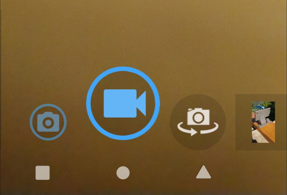
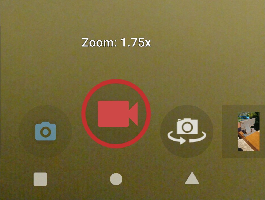
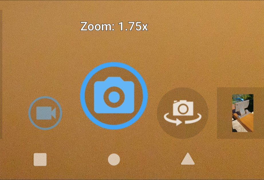
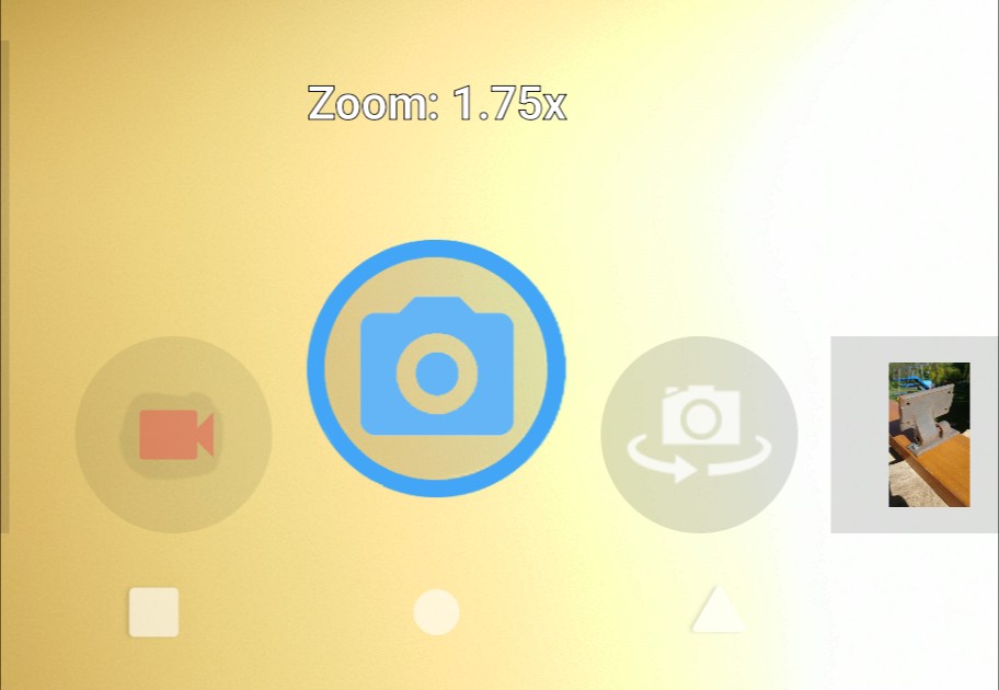
  1. improving the visual difference of the shutter buttons between video and photo mode, recording and not recording, by contrasting colour and style;
  2. not forgetting the zoom level when temporarily switching to another app and back, switching between photo and video modes, and the like.

Impressive? Is this everything you have ever wanted from a camera app? No, I didn’t think so. That’s not the point of it. Dear reader, it’s not for you. Not yet, anyway. Sorry!

Trax Cam is not yet intended as a product for ordinary users. Rather, the purpose of this project, at least initially, is as a learning exercise for me. The status of it, at the time of writing, is it is stable, being based on a stable version of Open Camera, and I am running it as my main camera app on two different phones, but I am not committing to making further fixes or updates. I might or might not continue developing or updating it. Switching to other projects will give me a broader and probably more useful learning experience.

Default Camera for /E/-OS

/e/-foundation‘s /e/-OS comes with OpenCamera as its default camera app. I had previously installed OpenCamera on my main LineageOS-powered phone, alongside the default LineageOS camera code-named ‘snap’.

I would sometimes switch between OpenCamera and ‘snap’. I like different things about them, mainly the range of options in OpenCamera and the simplicity of ‘snap’, with neither of them managing to bring the best possible combination, and both still having annoyances and room for improvement.

It was while evaluating /e/ that I noticed again several of the shortcomings of OpenCamera, and decided it could be time for me to do something about it. I had some ideas noted in my head, and have now written them down in a bug tracker.

Trax Cam Issues: https://lab.trax.im/trax.im/traxcam/-/issues . Issue #1 is Remember my zoom level , #2 is Boldly indicate photo/video/recording states (both still “open” as I am not satisfied that I have yet completed them as well as could be done), and I have opened several more.

At the same time, I discovered /e/-foundation is recruiting among other positions a Camera developer: “[You want] to make open source camera apps as good as high-end camera apps?” (If you are an “experienced (5+ years) Android developer”, check it out.) It’s good to see that /e/-foundation recognizes the need and seems to have some resources to tackle it.

In my opinion, one thing /e/ could do to encourage volunteer developers to develop OpenCamera (or another) in a useful direction for /e/ and other libre Android uses, would be to publish a road map or a prioritization of issues for what they consider needs to be done. I feel that projects providing a summary of what they want done is often missing and often a surprisingly effective driver in open source development. Developers tend to be quicker and more efficient at implementing something that is at least loosely specified (along with rationale to explain why) than creating something that they need to invent from scratch.

Comparing with Other Cameras

Besides OpenCamera and Lineage ‘snap’ I also briefly tried FreeDCam and OxygenOS camera (proprietary). Those each have some very slick UI designs which bear studying and would be nice to bring in. In particular, if I recall correctly they both use swipe to review the last and earlier taken pictures, which seems to me more intuitive and easier to use.

I noticed the OxygenOS camera used slick-looking rotary dials for analogue settings such as exposure compensation. I really liked this at first sight. In use, I found their behaviour a bit fussy and skiddy, easy to leave it on a random in-between value, hard to return quickly to the previously used value. It would be great if we could create something along those lines of analogue beauty, but with more positive and robust behaviour to set and leave a desired value. For example, I think it is common and so needs to be easy to switch between “auto” and the last used non-auto value. (Not just for camera controls, indeed, but for all kinds of settings in all apps.)

Available on My F-Droid App Store

You can try out Trax Cam if you like, even though it is not (currently) aimed at general use. https://fdroid.foad.me.uk/fdroid/repo/im.trax.cam_80.apk is a direct link to the installer file for my initial test version. It’s not published on Google Play store. You will need your “install from unknown sources” option enabled in Android settings.

I also put up my own F-Droid app store, and put Trax Cam up on it, so we can install it on phones through the f-droid app. This too is not currently intended for general end users. However, you are welcome to try it. First install the f-droid app (https://f-droid.org/), then add my repository’s URL (https://fdroid.foad.me.uk) under settings, repositories, add.

If you are unfamiliar with F-Droid, it comprises:

  • an Open/Libre app store system by which anyone can set up and serve their own app repository, and anyone can browse and install apps from such repositories; and
  • the F-Droid app, for browsing and installing apps from any such repositories; and
  • a repository of Free/Libre apps for Android, which is the default repository that the F-Droid app connects to until you tell it about other ones.

Putting up my own app store is part of my ambition to support independent creation of free/libre software and self-owned services.